Inspired by many old Spider-Man comic books, I attempted to turn myself into Peter Parker.
At first glance, it may not look as impressive as the Na'vi tutorial results, however, I did implore many of the same techniques in creating this avatar.
Originally, I was going to go for a full on smooth illustration look similar to the film A Scanner Darkly, where the actors were originally shot with video cameras and then drawn over and illustrated in post.
However, I felt that I should try and preserve some of the structure and realism so as to keep in line with the assignment at hand.
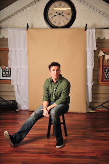
Here is the original photo I used as my headshot, an candid picture taken at a friends studio.
 |
| Huh?! |
As instructed by the Na'vi tutorial, I then created a hue/saturation layer to color my eyes just the right shade of hero blue (my eyes are green). To give them an additional pop, I then used the elliptical marquee tool to make the catchlight in my eyes slightly bigger and more round.
Creating layers filled with 50% grey, I then utilized the dodge and burn tools to bring out highlights and shadows to give better shape and contour to the face. Then I began to add more structure and design elements to give the avatar more of a comic book panel feel.
I then created multiple layers and used a poster edge filter on one and a pixilate and color halftone on the other. I then added layers of vibrance and layer masks to to keep effects segregated to specific areas. This is what gives the image that old, stylized, pop art feel where the primary color dots used to color and shade old comic strips can be seen clearly.
 |
| http://etc.usf.edu/clipart/86500/86538/86538_spider-web-border.htm |
 |
| http://www.mixtapepsd.com/how-to-make-a-comic-book-cartoon-effect/ |
 |
| https://tpwd.texas.gov/calendar/galveston-island/blood-splatter-hi.png/image_view_fullscreen |
 |
| http://peeweethekiwi.blogspot.com/ |
 |
| https://www.pinterest.com/pin/502010689683441413/ |
Using a similar technique that the artist in the Na'vi video demonstrated when coloring the skin of the model blue and then applying the facial tattoos/markings, I set out to apply the Spider-Man mask to the face. This was by far the most difficult part of the project.
First, I duplicated the original layer and saved it as a new project labeled "displacement." I used an advanced Gaussian blur filter, changed the image to black & white, and then saved it for later. This will be used later to help map out the Spidey mask to the face.
Returning to my original project, I used the quick select tool to highlight half of my face. Using Command+J, I separated the selected area to it's own layer and used the black & white adjustment filter to create a layer mask. I then used the brush tool to reveal the eyeball I had previously resized and colored.
This underlying black & white layer will make the Spidey mask stand out more on the face.
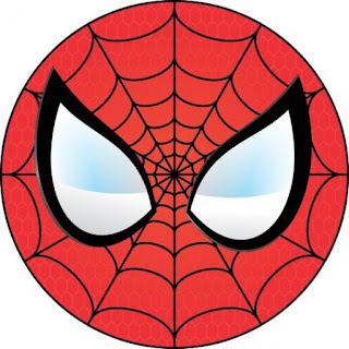
Converting the above Spider-Man symbol to a smart object, I then took to positioning and manipulating it to adhere to the face like a tight fitting mask.
Placing the Spidey mask over my face, I then turned down the opacity to about 30% for easier clarity during adjustments. Using free transform and rotate, I positioned the Spidey mask image to an approximate central mark. Then, by going to filter > distort > pinch, I was able to give the mask bulge to create depth to and the illusion that the mask is wrapped around my face.
Finding the best placement takes a lot of adjusting using the transform and warp tools but eventually I found the sweet spot. After placing the mask I blended using color burn in the blending options and set the opacity to 80%.
Then, I used the filter > distort > displace, to wrap the Spidey mask around the face. After making my settings in the displace menu window and pressing 'Ok', photoshop will prompt you to choose a file in which to displace the image upon. I chose the "displacement" folder I had made earlier and selected open.
After that, I simply erased any pieces or sections where the mask went outside of the face. I then added the thought bubble from the custom shape tool and used the horizontal font tool to type in my font. The name of the font is simply "Comic," I downloaded it for free from dafont.com. After finding the position and size I liked, I double clicked the font layer and added stroke and a drop shadow in the fx menu. I also added the pixilate and vibrance filters used on all the other graphics in keeping with the pop art, comic book style.
I'm sure I'm forgetting a step or two in there but that about covers it, I hope you all enjoy!


No comments:
Post a Comment