Monday, April 25, 2016

Web Design

Below are my initial schemes and plans for a website design. It still needs a bit of color correction and work, and I am finalizing the remaining "About" and "Contact" pages but here are the fruits of my labor thus far.

Home Page:
This is my homepage, the scenery is from a photo I took of the SCAD theater in Savannah, GA.

It's an absolutely gorgeous theater with a beautiful marquee, which usually showcases art from SCAD students, as seen here. I imagine in my final product, the broken section of lights flickering on and off.


The picture within the frames is one I took for my wife whilst driving home from an extremely long work trip. I told her that I feel like "I spend half my life in an automobile."

I combined my "selfie" with one taken by an SR-71 Blackbird pilot. I wanted to give the feel that I'm navigating the skies :)


I also did am markup of how the navigation buttons for the other pages within the site would highlight when hovered over.

Work page:
This is my work page, which includes all of the work I have done during this course so far. I kept in with the simplicity of the museum feel and left out any other buttons to navigate to other pages, save for the homepage button, which is the geometric rose featured amongst the other artwork. Flores is my second last name and is Spanish for flower, an element I decided to feature within my design.
Once you click on an image, it will be displayed prominently on the the page, leaving an opaque frame in which the original page is still visible.


Wednesday, April 6, 2016

Fantasy Avatar

Using the advanced and basic techniques we have learned thus far, I have created a comic book influenced fantasy avatar.

Inspired by many old Spider-Man comic books, I attempted to turn myself into Peter Parker.

At first glance, it may not look as impressive as the Na'vi tutorial results, however, I did implore many of the same techniques in creating this avatar.
Originally, I was going to go for a full on smooth illustration look similar to the film A Scanner Darkly, where the actors were originally shot with video cameras and then drawn over and illustrated in post.
However, I felt that I should try and preserve some of the structure and realism so as to keep in line with the assignment at hand. 
Here is the original photo I used as my headshot, an candid picture taken at a friends studio.
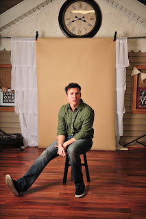
Huh?!
From there I cropped and used the recommended settings and texturing techniques explained in the Na'vi tutorial. I used the smudge tool to fix my crooked, broken nose and slightly enlarged my eyes and pupils to give the photo that doe-eyed comic hero feel. By feathering and using masks, I was able to hide these edits in separate layers. 
As instructed by the Na'vi tutorial, I then created a hue/saturation layer to color my eyes just the right shade of hero blue (my eyes are green). To give them an additional pop, I then used the elliptical marquee tool to make the catchlight in my eyes slightly bigger and more round. 
Creating layers filled with 50% grey, I then utilized the dodge and burn tools to bring out highlights and shadows to give better shape and contour to the face. Then I began to add more structure and design elements to give the avatar more of a comic book panel feel. 
http://etc.usf.edu/clipart/86500/86538/86538_spider-web-border.htm

http://www.mixtapepsd.com/how-to-make-a-comic-book-cartoon-effect/

https://tpwd.texas.gov/calendar/galveston-island/blood-splatter-hi.png/image_view_fullscreen

http://peeweethekiwi.blogspot.com/
I then created multiple layers and used a poster edge filter on one and a pixilate and color halftone on the other. I then added layers of vibrance and layer masks to to keep effects segregated to specific areas. This is what gives the image that old, stylized, pop art feel where the primary color dots used to color and shade old comic strips can be seen clearly.
https://www.pinterest.com/pin/502010689683441413/

Using a similar technique that the artist in the Na'vi video demonstrated when coloring the skin of the model blue and then applying the facial tattoos/markings, I set out to apply the Spider-Man mask to the face. This was by far the most difficult part of the project. 

First, I duplicated the original layer and saved it as a new project labeled "displacement." I used an advanced Gaussian blur filter, changed the image to black & white, and then saved it for later. This will be used later to help map out the Spidey mask to the face. 
 
Returning to my original project, I used the quick select tool to highlight half of my face. Using Command+J, I separated the selected area to it's own layer and used the black & white adjustment filter to create a layer mask. I then used the brush tool to reveal the eyeball I had previously resized and colored.
This underlying black & white layer will make the Spidey mask stand out more on the face. 
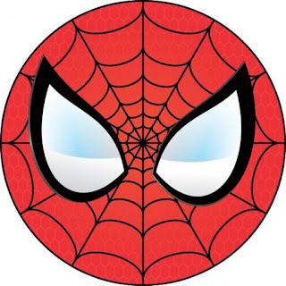
Converting the above Spider-Man symbol to a smart object, I then took to positioning and manipulating it to adhere to the face like a tight fitting mask.

Placing the Spidey mask over my face, I then turned down the opacity to about 30% for easier clarity during adjustments. Using free transform and rotate, I positioned the Spidey mask image to an approximate central mark. Then, by going to filter > distort > pinch, I was able to give the mask bulge to create depth to and the illusion that the mask is wrapped around my face. 
Finding the best placement takes a lot of adjusting using the transform and warp tools but eventually I found the sweet spot. After placing the mask I blended using color burn in the blending options and set the opacity to 80%.

Then, I used the filter > distort > displace, to wrap the Spidey mask around the face. After making my settings in the displace menu window and pressing 'Ok', photoshop will prompt you to choose a file in which to displace the image upon. I chose the "displacement" folder I had made earlier and selected open.

After that, I simply erased any pieces or sections where the mask went outside of the face. I then added the thought bubble from the custom shape tool and used the horizontal font tool to type in my font. The name of the font is simply "Comic," I downloaded it for free from dafont.com. After finding the position and size I liked, I double clicked the font layer and added stroke and a drop shadow in the fx menu. I also added the pixilate and vibrance filters used on all the other graphics in keeping with the pop art, comic book style.

I'm sure I'm forgetting a step or two in there but that about covers it, I hope you all enjoy!


Fantasy Avatar Preliminary Ideas

I've always been a big comic book geek, this project provided the perfect opportunity to try my hand at becoming a superhero. My last feature film, Germ Z, featured an illustrated version of myself on the cover. I was just as excited about that than the release of the movie itself :)
Whilst the contract just ended with Netflix, it's still available on iTunes and other streaming services. If you have a chance, check it out!
Anyhow, I've seen comic books made from altered photo images and photorealistic illustrations in the past, I'd like to utilize the examples shown in the Na'vi tutorial and other examples to create an avatar that is a mixture of photorealism and classic pop art illustration.


Friday, March 18, 2016

Jazz Man Book Design

After careful research, I have created a contemporary cover with a modern feel and given a comedic cartoon character an existential look. Or at least that's what I hope I did.


After creating this book I felt inspired so I created a biography book cover for another notable Simpsons character below.

Only a true Simpsons fan will get this one

Below are images used for each project.

http://recapguide.com/recap/117/The-Simpsons/season-24/episode-19/
https://www.simpsonsworld.com/character/bleeding_gums_murphy
https://commons.esc.edu/rhiannarogers/

http://7-themes.com/7036666-rainbow-on-sky.html

http://5ean.deviantart.com/art/another-mountainscape-215857599


http://www.zmescience.com/ecology/nuclear-reactors-cover-the-world-053534/

https://www.reddit.com/r/pcmasterrace/comments/27oqnw/ive_seen_at_least_5_people_today_asking_for_tips/


Thursday, March 17, 2016

Preliminary Book Cover Design

I love jazz music, I used to have friends over on thursday nights back at my first college, where we would drink cheap wine and listen to NPR's evening of jazz. I'm also a huge Simpsons fan and any fan of the show can tell you that there is a very memorable jazz musician that had a major affect on little Lisa Simpson's life before he past away during an episode.
That's right, Bleeding Gums Murphy. Though many Simpsons books have been published, there's never been a faux biography for the ol' jazz man.
What a great subject, you can make up anything and it would still be as real as any Bob Dylan biography :)


Saturday, March 5, 2016

Awareness Poster

Initially I started working with images similar to my sketches and trying to create a carrot that morphed into a snake like I had drawn up.


I thought the snake morphing from the carrot would look better if I used an orange snake similarly colored to the carrot. It didn't. 

I loved this image or idea of freshly pulled carrots from the ground. I found many other images just like the one above but ultimately, it just looked like the gardener had accidentally pulled up a snake from its burrow or the snake had been mixed in with all the carrots.

So instead I decided to work with a single carrot, I thought the idea of someone eating said carrot would better deliver the message that the GMO's are in foods we all already eat. 
https://battlebears.vanillaforums.com/discussion/28548/things-on-the-forums-only-you-can-say-youve-done
By the way, it's quite difficult to find an image of someone eating a carrot on the web that does not look phallic in some manner or another. Many even point out and make fun of this fact.

I managed to find a perfect one, however, and decided to use a snake that was not only notoriously dangerous but also stood out from the carrot itself. A rattlesnake was a great choice, as it's known for its deadly bite and ferocity. From what I can tell, all of the orange snakes above aren't even poisonous.
http://easyscienceforkids.com/all-about-rattlesnakes/
This worked out much better, as the striking rattlesnake makes the carrot appear much more deadly and adds much more of an element of danger. The complete horizontal placement of the carrot and most everything else in the photo also aids with the typography and aids with it's placement, and
adds value to the posters design. Overall, I'm pretty happy with it!

Wednesday, March 2, 2016

Preliminary Awareness Poster Ideas

After careful thought and debate I sketched up a few options for an Awareness Poster for some social causes I feel need more attention.

The above sketch depicts a carrot morphing into a poisonous snake. The message is to show (as I explained in my module 3 discussion) that there is more hidden in our food than we know.

This second image is meant to resemble a word cloud in the shape of a condom... a, uh, filled condom. Hopefully the phallus shape would be enough to cause shock or garner attention. I'd like to also note that I haven't drawn anything this phallic since middle school. It's sad that we still have to educate people about having safe sex but the all the things listed in this word cloud are still very real and growing dangers. 

Sunday, February 7, 2016

Jipped By Cans Greatest Hits Album Release Ad


In this second take I did some additional cleanup as suggested and also added a bit more contouring and shadowing. For fun, I also turned my photomontage into an album release poster with included quotes from our instructor and classmates.

It's kind of hard to see but the record logo is in the bottom right-hand corner. It's called 'Sunshine and Puppy Dogs Records,' a previous incarnation of Mario and Gina, original creators of Jipped By Cans.

The following are a few of the images used in the creation of this photomontage before edited and manipulated:
http://handbookofnaturestudy.com/
http://www.shutterstock.com/

http://www.sidereel.com/
https://flipboard.com/
  
https://www.pinterest.com/lovelandfan/
https://www.youtube.com/
  
http://www.timeout.com/london/bars-pubs/london-cocktail-week-the-highlights

And for your viewing pleasure, here are some previous album covers for Jipped By Cans, created by Mario and Gina. Including newly released album, Short Bus.