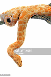
Initially I started working with images similar to my sketches and trying to create a carrot that morphed into a snake like I had drawn up.
I thought the snake morphing from the carrot would look better if I used an orange snake similarly colored to the carrot. It didn't.
I loved this image or idea of freshly pulled carrots from the ground. I found many other images just like the one above but ultimately, it just looked like the gardener had accidentally pulled up a snake from its burrow or the snake had been mixed in with all the carrots.
So instead I decided to work with a single carrot, I thought the idea of someone eating said carrot would better deliver the message that the GMO's are in foods we all already eat.
 |
| https://battlebears.vanillaforums.com/discussion/28548/things-on-the-forums-only-you-can-say-youve-done |
By the way, it's quite difficult to find an image of someone eating a carrot on the web that does not look phallic in some manner or another. Many even point out and make fun of this fact.
I managed to find a perfect one, however, and decided to use a snake that was not only notoriously dangerous but also stood out from the carrot itself. A rattlesnake was a great choice, as it's known for its deadly bite and ferocity. From what I can tell, all of the orange snakes above aren't even poisonous.
 |
| http://easyscienceforkids.com/all-about-rattlesnakes/ |
This worked out much better, as the striking rattlesnake makes the carrot appear much more deadly and adds much more of an element of danger. The complete horizontal placement of the carrot and most everything else in the photo also aids with the typography and aids with it's placement, and
adds value to the posters design. Overall, I'm pretty happy with it!


